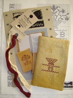
A few weeks ago I was at Barnes & Noble and thumbed through the October issue of Just Cross Stitch Magazine. It is the issue with the "ornament issue preview." I did not look at it very closely, thinking they were showing the ornaments as a teaser. I happened to pick up Jeanne's magazine the week of Sue's funeral and looked at it more closely. The preview shows photos of ornaments from six designers, with charts for a "companion" ornament by each of those six designers. Bonanza, Batman! That's an extra 6 ornaments! Needless to say, I now own that issue of JCS.
I won't rehash how much I love the ornament issue. If you missed my post about it last year, you can check it out here.
Thanks to Anna, Tessa and Jenna for the input on my BOAF Notebook Sampler. Every time I looked at that silly single row of stitches, it looked off! It was just bugging me too much, so I ripped. Better now than when I have more hours invested, eh? Here is what I accomplished last night.

If the whole notebook looks a bit "off" in the picture, it is because it IS! It needs to be properly pressed. Of course, I couldn't be bothered to do that on Monday when I was in a red hot rush to start something for MIOM. It is rather silly, but I feel much better now that I've ripped and restitched. Unfortunately, as soon as I had the placement situation under control I was faced with the dreaded initials problem. I solved that by choosing just the "M" and centering it. I'll add some sort of blob or swirl on either side later on.
The closer I get to the top of the design the more concerned I am about floss choices. The design calls for three colors and I've only chosen two. I'm toying with the idea of using WDW Deep Sea for part of the flowers. The design calls for Cinnamon, Oatmeal and Maple Syrup. They call it the "Brown Version" but it sounds like breakfast to me. I'm using Cinnamon and Buttermilk, but I'm not in favor of adding brown to the red and white. I'm not sure I really want red, white and blue either. I might just stick with the two colors. So far they look pretty good.
That's my update for today. Has anyone seen the ornament issue yet?
4 comments:
I'm still eagerly awaiting the ornament issue! I was really surprised to see the "bonus" ornaments in the last JCS issue as well. I have some of the threads on order for the Little House one.
So are you like Madonna, just one name, one initial? Or did I miss something and just embarrass myself?
I know people already have the ornament magazine. I have not been shopping [yet] -- too many repair bills to take care of this week.
Now, what JCS has bonus orns? I was in B&N yesterday & didn't notice any bonus feature - or preview. I'll have to look again.
I love Anna's comment -- and yeah, you are sorta like Madonna ... you know people! Just add TT to your M ... LOL
Dang GF, can you tell I didn't get enough sleep last night?
I love this design! How cute!
Post a Comment